Treasury corporate brand guidelines
Our brand is …
Foundational
Our brand’s core, in conjunction with Treasury’s vision, is based around a solid foundation on which to build.
Contemporary
Our visual language is contemporary, making it easy for the audience to connect with the brand.
Trusted
Consistent use of our visual language builds recognition which instils confidence in our audience. Our trust mark serves to further identify our work. It symbolises stability and trustworthiness.
Flexible
Our brand’s visual language enables flexibility across all channels and provides a strong base to evolve over time.
Our logo
Our logo aligns with the Australian Government branding guidelines.
Where size permits, the Treasury logo must be used on all corporate materials.
The Treasury logo

Colour usage
The Treasury logo should be reproduced in one colour only, preferably brand navy.
Colour contrast of the Treasury logo and its background should meet WCAG 2.0 AA accessibility standards. The logo should not be represented in any more than one colour but can appear as one colour on another colour.

Refer to the Australian Government Branding Guidelines on the use of the Australian Government logo
Applying the logo
An isolation zone has been established to ensure that the dignity of the logo is not jeopardised through crowding. This zone is defined as ‘X‘ and is based upon the size of the capital ‘A‘ in ‘Australian Government‘ — see diagram below for an example. This zone should be seen as a minimum dimension, and it applies to every form of the logo, and in every application of the logo.
Isolation zone demonstrated by X
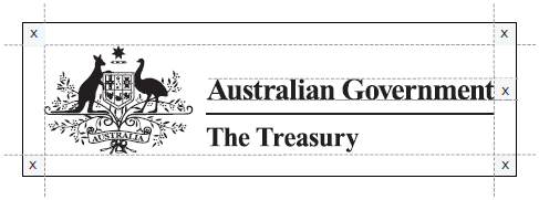
The Treasury logo should always have prominence over and above other elements and where possible, the logo should be placed at the top of the item it appears on. The Commonwealth Coat of Arms has minimum width requirements for both print and web use.
Minimum width:
Print: 20mm
Web: 75px

Our trust mark

Our trust mark reflects Treasury’s purpose.
It is foundational, contemporary and trusted, while also being flexible in application.
The Treasury trust mark has been created to complement our visual language. It should never be used in place of the Treasury logo, or combined with it.
Our palette
Our palette is neutral and optimistic.
It aims to invoke a sense of trust through our visual communication. The palette is flexible and intended to be used in a variety of applications.
Brand colours
Accessible on white/light grey (WCAG 2.0 AA)
Navy
#2C384A
R: 44 G: 56 B: 74
C: 84 M: 71 Y: 48 K: 43
Green
#4D7861
R: 77 G: 120 B: 97
C: 72 M: 35 Y: 66 K:16
Mid Blue
#5D779D
R: 93 G: 119 B: 157
C: 68 M: 48 Y: 19 K:5
Accessible on navy/black (WCAG 2.0 AA)
Lime
#B1F0CF
R: 177 G: 240 B: 207
C: 28 M: 0 Y: 26 K:0
Light Blue
#90B6F0
R: 144 G: 182 B: 240
C: 40 M: 20 Y: 0 K: 0
Orange
#F0AE81
R: 240 G: 174 B: 129
C: 4 M: 36 Y: 51 K:0
Black
#000000
R: 0 G: 0 B: 0
C: 0 M: 0 Y: 0 K:100
Light Grey
#EEEEEE
R: 238 G: 238 B: 238
C: 5 M: 4 Y: 4 K: 0
White
#FFFFFF
R: 255 G: 255 B: 255
C: 0 M: 0 Y: 0 K:0
Visual language
Elements are drawn from our trust mark to create the visual language.
The use of these elements improves brand recognition and strengthens its integrity.
Tints and overlays of overlapping rectangles
Overlapping rectangles and semi-transparent tints are used to create visual interest and represent our involvement in multiple aspects of the economy.

Key text emphasis
Rectangles from the mark are repurposed to highlight key text providing a contemporary visual device.
Tints of 30-50% should be used.
When placing manually, the top of the box should run through the centre of a lower case ‘e’. The height of the box should be the same as a lower case ‘e’.
Highlight text
Highlight text
Highlight text
Highlight text
Elements pulled from the mark and extended
Elements can be extended, and layers added or removed, to create subtle bounding boxes or to lead the eye through a design.

Gradient feather
Visual elements can have a gradient feather applied to pare back dominance, lead the eye or soften a design.

Typography
Gilroy
Gilroy is a modern sans serif typeface with a geometric touch and has high legibility across all mediums.
This typeface is available for licensing.
Thin
AaBbCcDdEeFfGgHhIiJjKkLlMm
NnOoPpQqRrSsTtUuVvWwXxYyZz
1234567890
UltraLight
AaBbCcDdEeFfGgHhIiJjKkLlMm
NnOoPpQqRrSsTtUuVvWwXxYyZz
1234567890
Light
AaBbCcDdEeFfGgHhIiJjKkLlMm
NnOoPpQqRrSsTtUuVvWwXxYyZz
1234567890
Regular
AaBbCcDdEeFfGgHhIiJjKkLlMm
NnOoPpQqRrSsTtUuVvWwXxYyZz
1234567890
Medium
AaBbCcDdEeFfGgHhIiJjKkLlMm
NnOoPpQqRrSsTtUuVvWwXxYyZz
1234567890
SemiBold
AaBbCcDdEeFfGgHhIiJjKkLlMm
NnOoPpQqRrSsTtUuVvWwXxYyZz
1234567890
Bold
AaBbCcDdEeFfGgHhIiJjKkLlMm
NnOoPpQqRrSsTtUuVvWwXxYyZz
1234567890
ExtraBold
AaBbCcDdEeFfGgHhIiJjKkLlMm
NnOoPpQqRrSsTtUuVvWwXxYyZz
1234567890
Black
AaBbCcDdEeFfGgHhIiJjKkLlMm
NnOoPpQqRrSsTtUuVvWwXxYyZz
1234567890
Heavy
AaBbCcDdEeFfGgHhIiJjKkLlMm
NnOoPpQqRrSsTtUuVvWwXxYyZz
1234567890
Typographic weight pairings
It is important to maintain contrast in the weight of type pairings. This allows for clarity, and a strong typographic hierarchy across all communications. As an example, Bold weight can be paired with Light weight, or ExtraBold weight can be paired with Regular weight.
Bold
Header
Light
Subhead
ExtraBold
Header
Regular
Subhead
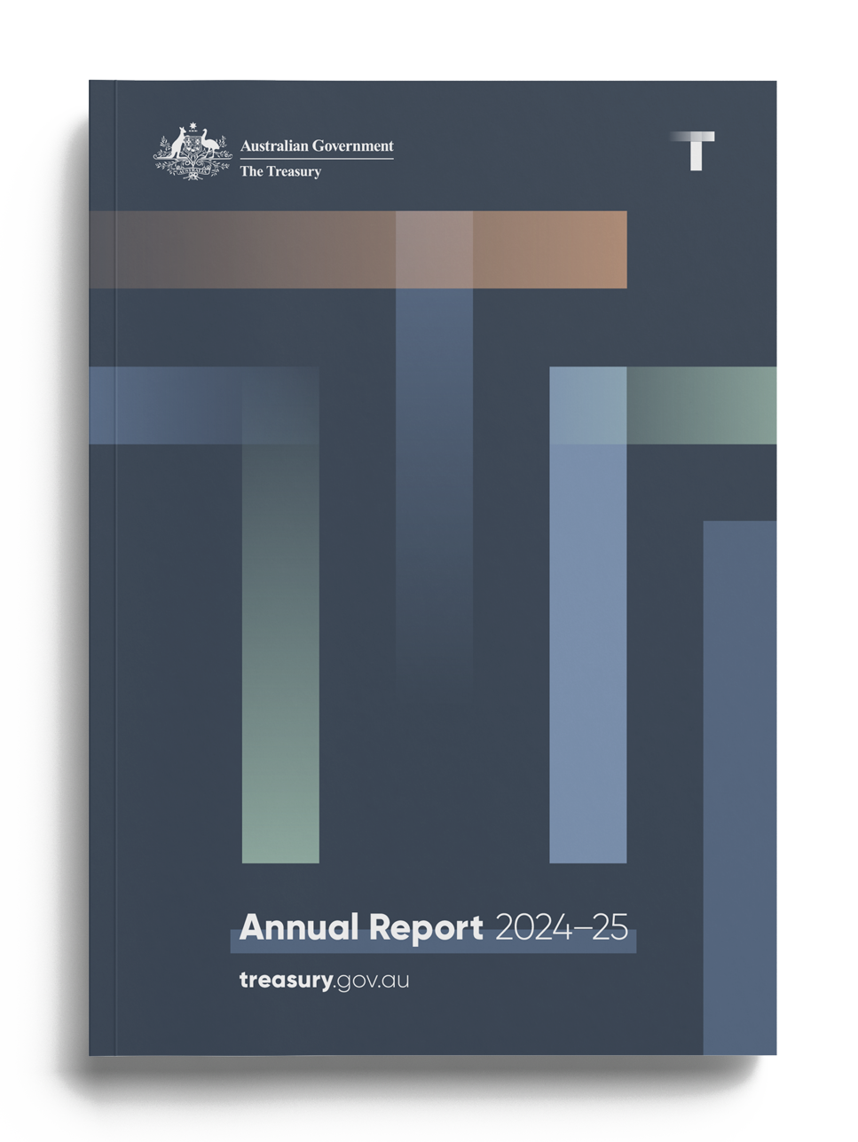
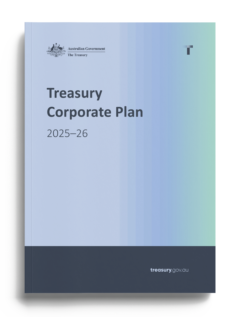
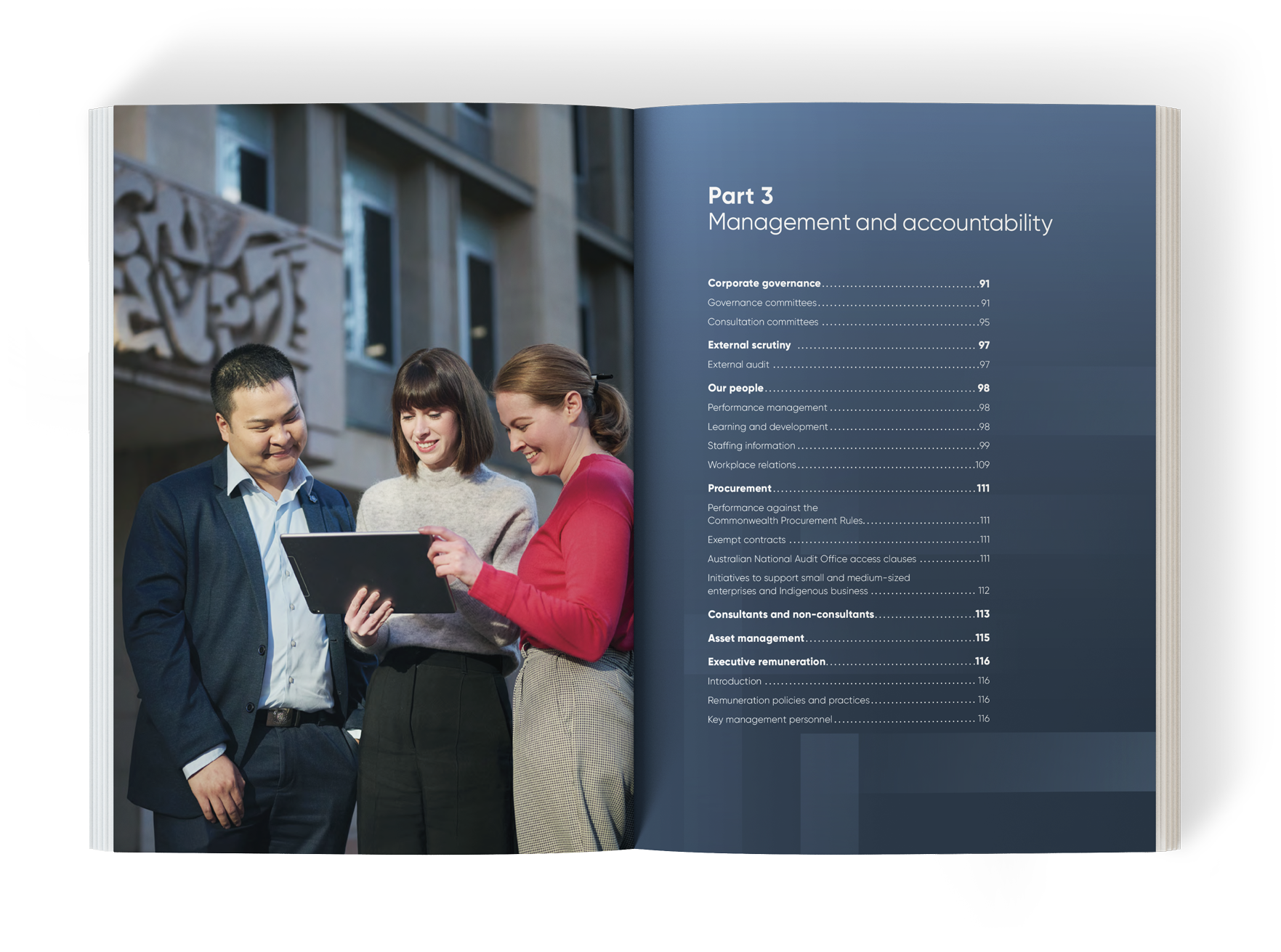
Brand applications
See how the brand has been applied.
To get an understanding of the flexibility and intention of the brand, see some applications below.
Publications
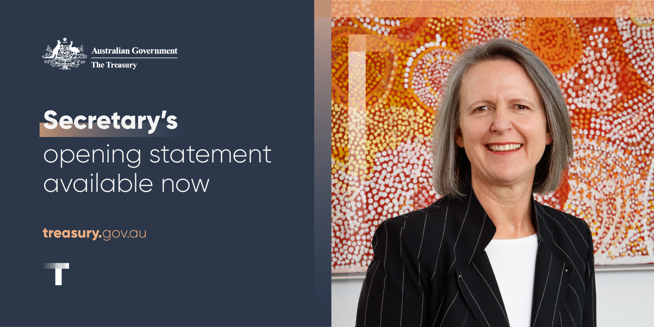
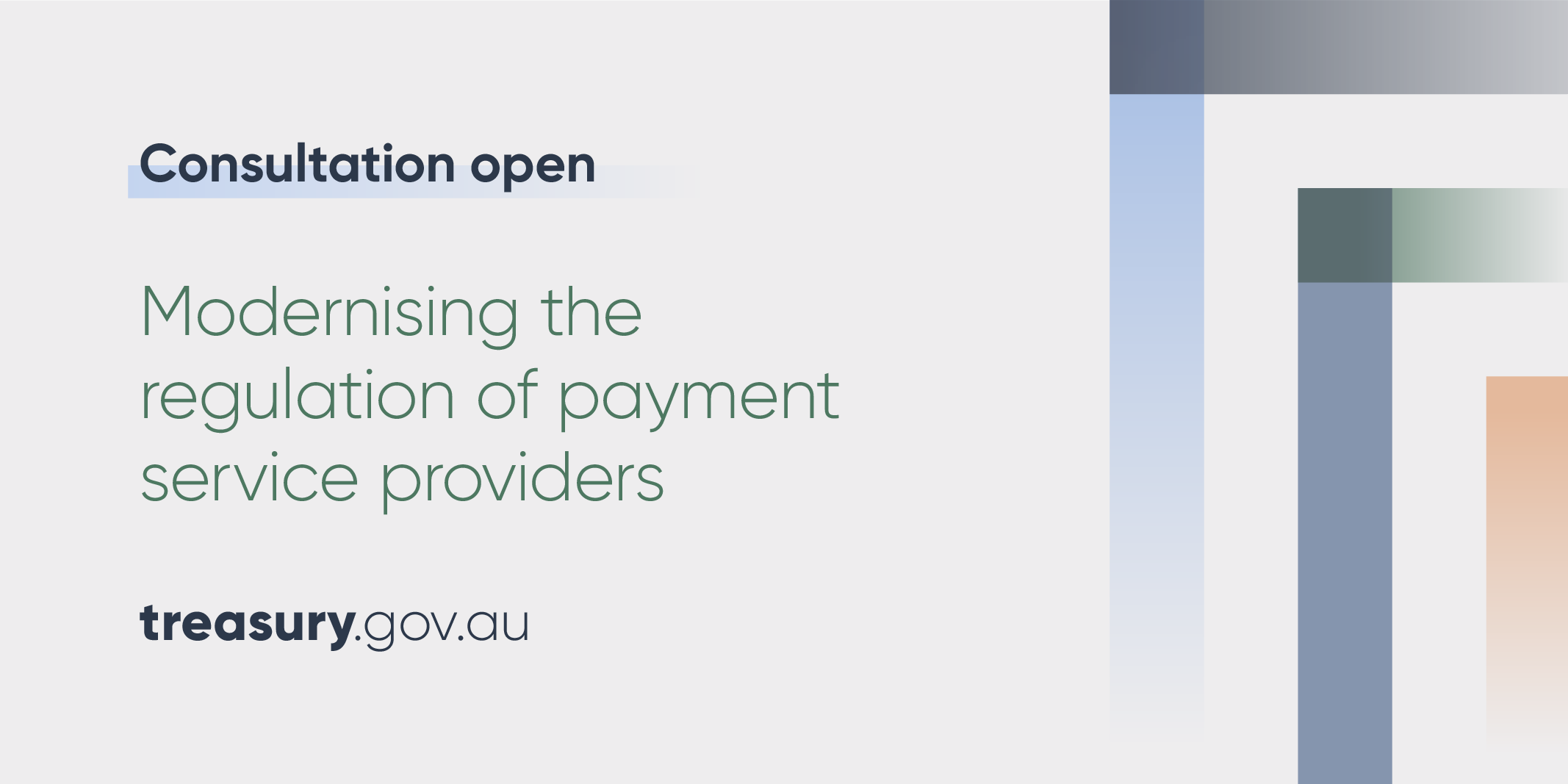
Social media
Downloads
Download our brand.
The Treasury logo and trust mark are available to download in instances where our identity isn’t already applied and needs to be present.
Refer to the Australian Government Branding Guidelines on the use of the Australian Government logo.
Contact CreativeServicesDL@treasury.gov.au to check your usage complies.
![Download trust mark [PNG]](downloads/TSY-Trust-Mark-Navy.png)
![Download trust mark white [PNG]](downloads/TSY-Trust-Mark-White.png)